COLOURS TO LIVE BY
BLUE
Deep breaths, clear thinking, and calm confidence. If you’re craving a home (and a headspace) that feels more grounded, blue is your easiest shortcut.

POWDER BLUE
Essence
Softness, reassurance, gentleness.
Therapeutic
A visual exhale - great when you want calm without coldness.
VISUAL BLISS
Pair with neutrals and powder pink.

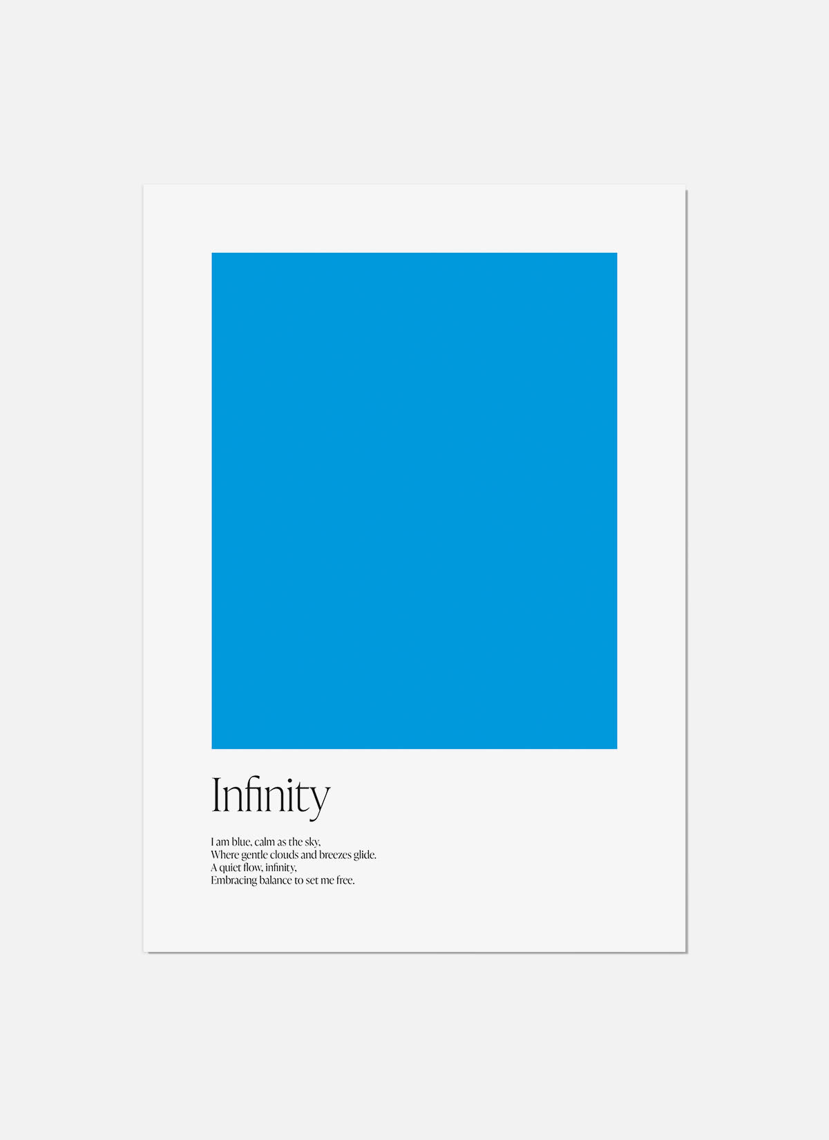
Aqua Blue
ESSENCE
Openness, optimism, clarity.
Therapeutic
Like mental decluttering - light, breathable, and friendly.
VISUAL BLISS
Pair with soft warm greys or tangerine.

COBALT BLUE
ESSENCE
Confidence, boldness, focus.
Therapeutic
Grounding and dependable - great for decision-heavy days.
VISUAL BLISS
Pair with mustard or terracota.

YOU TIME
Make a brew, light a candle and some incense. Close your eyes, breath deeply and visualise a blue surrounding for an instant moment of calm and clarity.

BLUE IN NATURE
Compared to greens and browns, many blue plants and animals create the colour through structure (how light reflects) rather than pigment.

YOUR SPACE
Blue is often associated with calm because it’s so present in nature - sky and water are the big two.
In interiors, blue can help a space feel:
More spacious lighter blues can visually “open” a room.
More restful deeper blues can feel protective and cocoon-like.
More focused clean, cooler blues can feel crisp and organised.
More balanced blue can soften loud colour schemes and calm busy patterns.

STYLE TIP
Blue changes with lighting.
North-facing rooms can make blues feel cooler; warm bulbs, neutrals and texture help keep it inviting.
DISCOVER THE BLUE EDIT